Clarity
OtherLeft · Behavioral health
A behavioral health hospital had two problems that turned out to be the same one.
There aren't enough clinicians, and the tools they have don't help. So patients don't get much one-on-one time, and care falls back on group sessions built for everyone and relevant to no one. People sit through topics that don't apply to them and check out. Meanwhile the clinicians are buried in regulatory paperwork, and their supervisors are measured on whether the paperwork got done — not on whether anyone got better.
“I don't need to be here. My mom does.”
What we designed
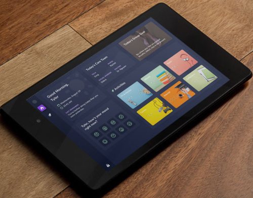
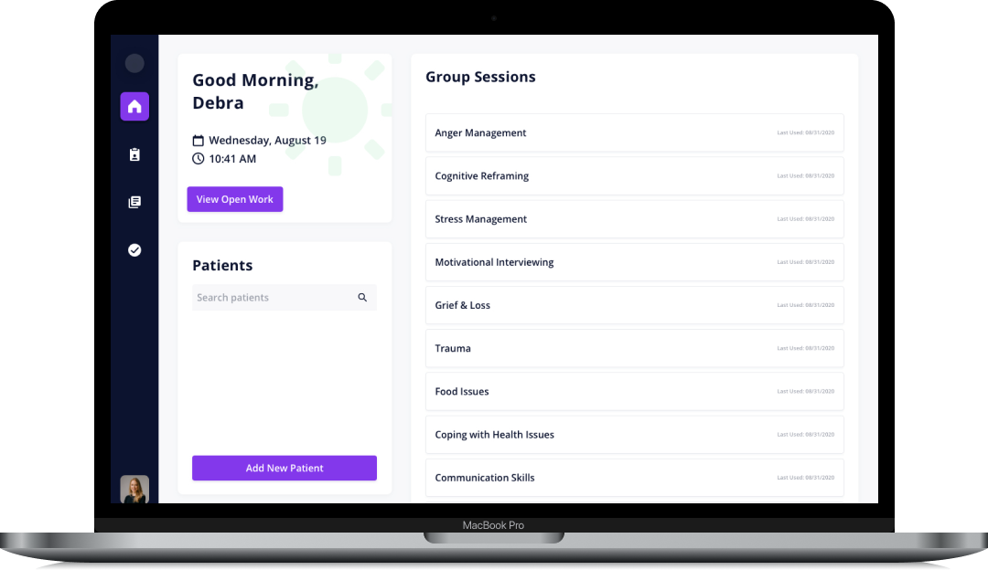
Clarity is two things that work together: a tablet in the patient's hands and an app for the care team.
For patients, it turns a disorienting stay on a locked unit into a day they can see and shape. Their schedule. Who's on their care team. A quick check-in on how they're doing. A library of shows, music, books, and games filtered to what's right for them, with small moments of encouragement built into the things they already want to do. When they want a say in tomorrow's group, they vote on the topic.
For the care team, it removes the busywork. The day opens with a short list of what actually needs to happen. Group notes get written once and flow into every patient's chart. An evening of documentation becomes a few minutes between sessions — and everything a patient does on the tablet becomes signal the team can act on.
My role
I led strategy and design — the research, the personas, the day-in-the-life journey maps, and the two products that came out of them. That work became a full engineering backlog and a year-long roadmap the team built against.
Accessibility
Accessibility set the constraints, not the finishing touches: a third-grade reading level, multiple languages, ASL and TTY, and a design that assumes a patient might not have headphones or remember a password.